
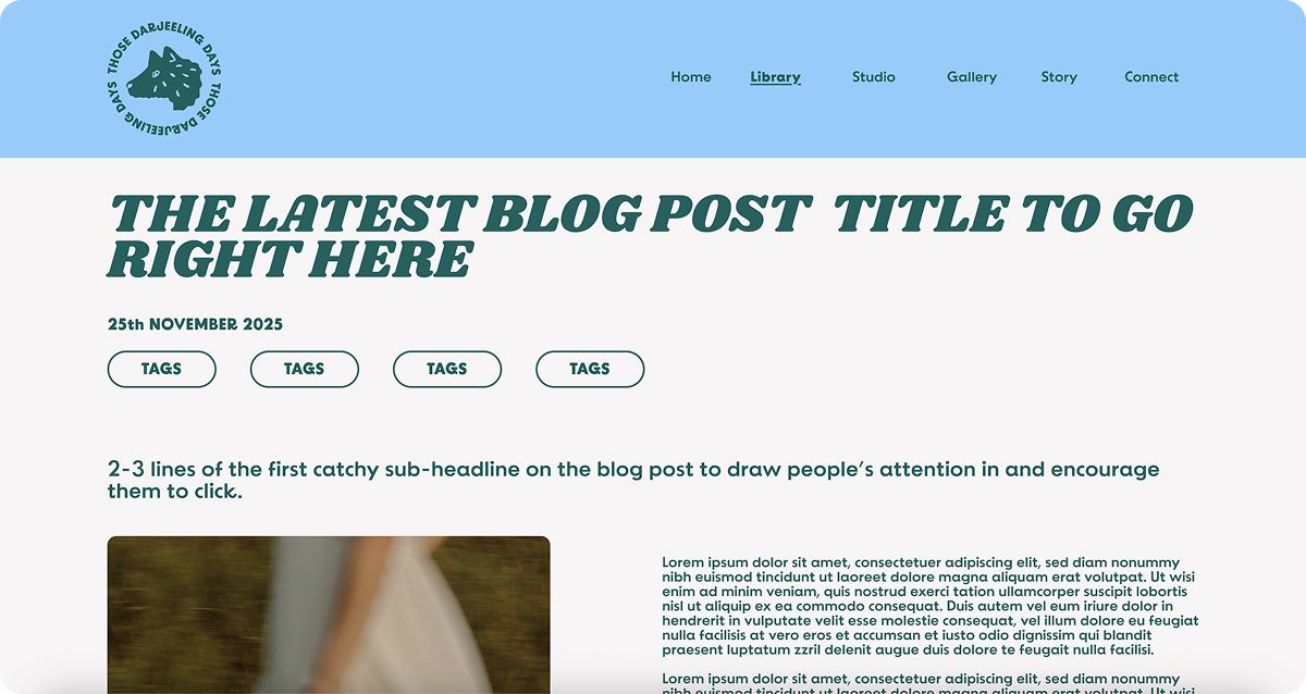
Wolf: connection + adventure
Ottawa, Canada

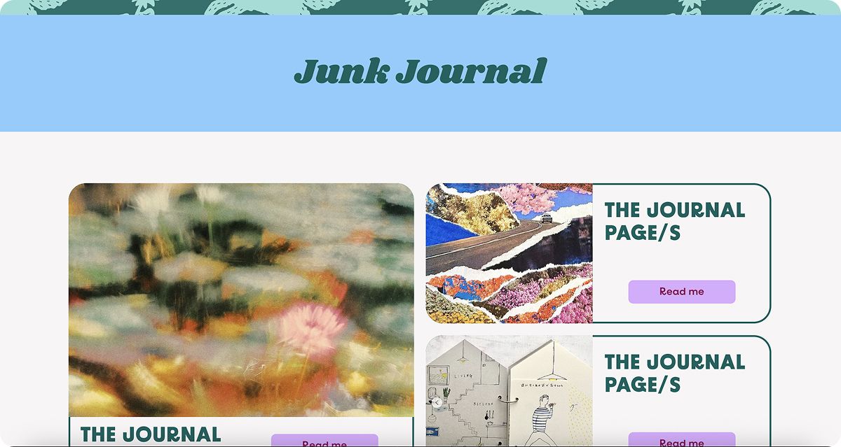
Develop a brand kit for an upcoming creative blog that covers a wide range of creative interests the blogger enjoys exploring. It is to be a contemporary blog featuring regular blog posts on top of zines, junk journal posts and a gallery wall featuring the blogger’s photographs.
Therefore the brand identity needed to fully reflect both the blog and the blogger, seeing as they are one and the same.

The design concept was inspired by the warmth felt from reading a good story or dreamily crafting something in a cosy nook far away from the world going on around you. A safe haven for creative practices, playfulness and building a community of like-minded souls. But also a way to look back fondly on the journey with a good does of nostalgia.
It is a (virtual) den where the blogger can explore her curiosities in comfort. It is a place where she can be playful and find her courage as well as bring fellow creatives together by sharing what she has learned and discovered along the way. To have a space where we are free to be curious and whimsically inventive.


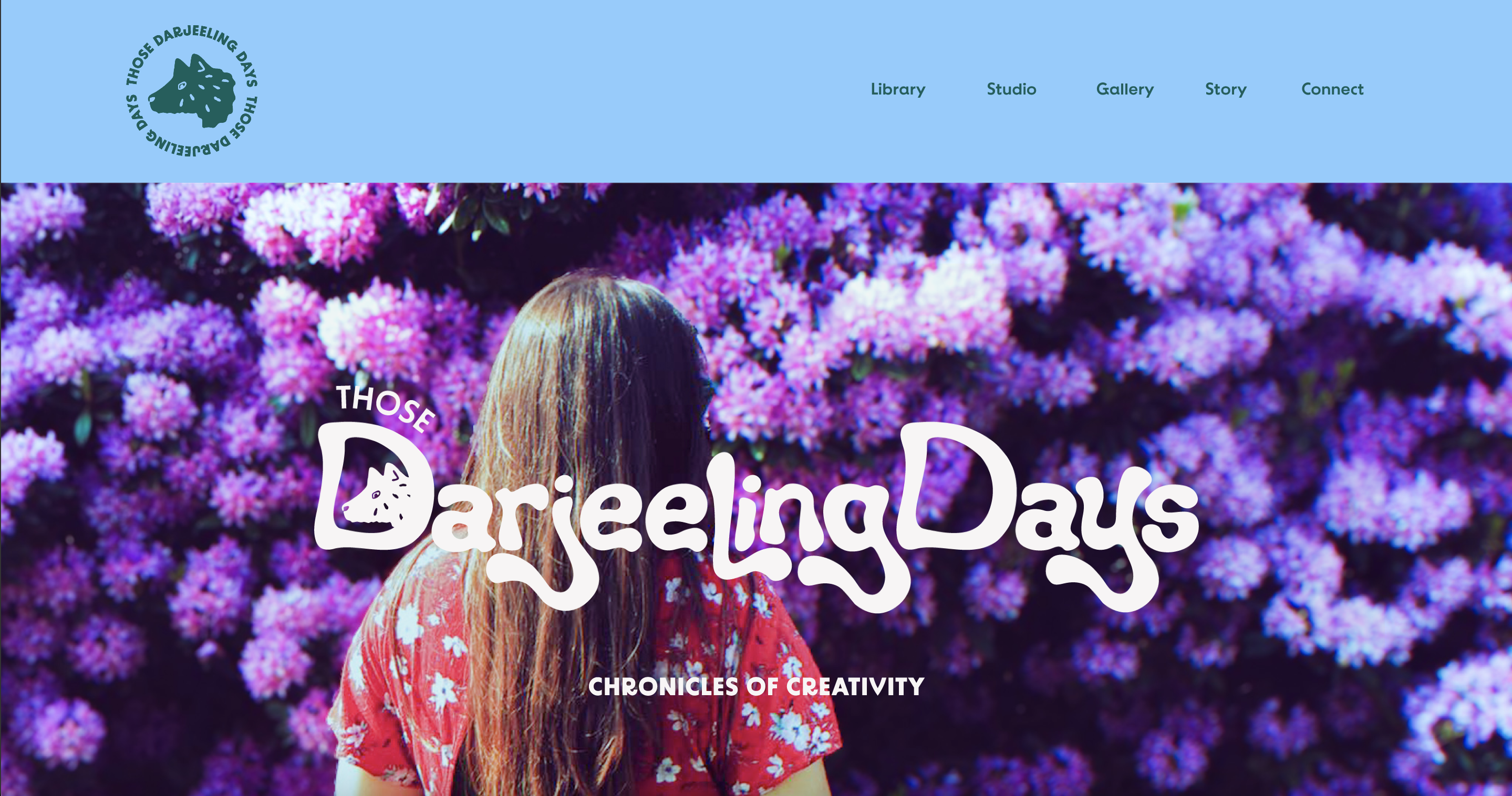
The lettering was hand-drawn and designed specifically for the blog. The curvy, organic lines in the custom designed typeface brought in that nostalgic feeling with a retro twist. The wolf character was brought in to give both a storybook feel and a sense that adventure is around every corner, you just have to go out and seek it. Adding the animal character gave it a whimsical and playful edge; giving space for curiosity to abound.
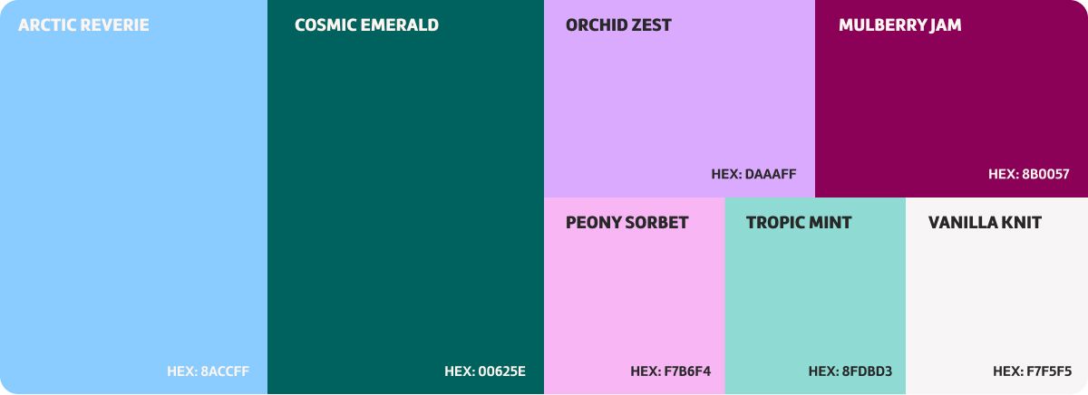
The colour palette was really where the folksy aspect came in. The two primary colours are the blue and dark green, followed by the purple and burgundy as secondary colours and the pink, light green and white being the tertiary colours.
It was important to have some brighter colours to lend to the playful energy whilst balancing it out with some more subdued colours for that grounded, cosy warmth. The colour palette needed to feel comforting, whimsical and playful, hence the choice of not overly bright or overly neutral hues.
Wolf: connection + adventure
Bear: Wisdom + Cosiness

Otter: Creativity + Play
Creatures often feature in storybooks, so we decided to bring them forward into the brand design by selecting three animals that represented the values of the blog: Connection, Adventure, Wisdom, Cosiness, Creativity and Play.
They are all hand-drawn and inspired by lino print design. Despite it being a creative blog, the wolf is the primary character because it represents connection and adventure, the two main themes of the blog - connecting to others and being brave by exploring.


The six illustrations are minor features that were brought into the brand patterns (see below) to add to the whimsy, the playfulness and the overall storybook aesthetic. They are all elements that represent either the blogger or the blog itself and are inspired by nature.
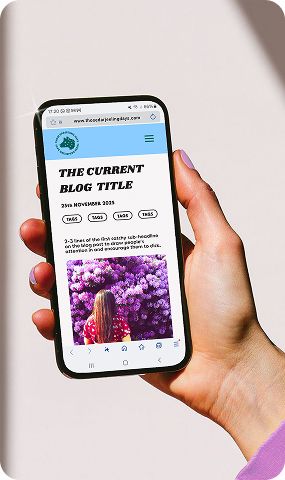
These minor illustrations will also be used for smaller social media highlights due to their small size. Their design style was kept in line with the primary characters (see above).
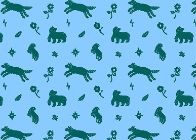
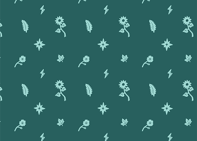
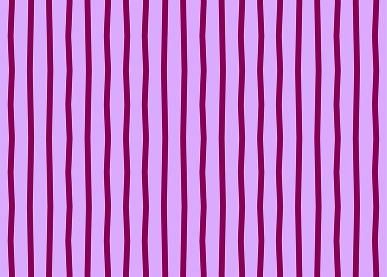
Three brand patterns were designed for the blog, however for website purposes, only the first one was used (in two of the colour pairings) as aesthetically, it looked more cohesive. However, should the brand ever expand into other areas (including analogue areas) they have the choice of using the other brand patterns.
A branding and graphic project for a brand new creative blog that has recently been set up.
A branding and graphic project for a brand new creative blog that has recently been set up.