
Olive Branch Crown
Guildford, United Kingdom
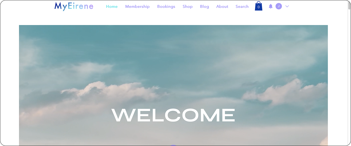

Craft a brand identity for an online mindfulness and wellbeing platform that operated via a membership subscription. It blended holistic and scientific practices and aimed to help people who were struggling with low to mid level mental health issues as a result of the pandemic, by providing them with non-medical, affordable options to help improve their mental wellbeing.
The company owner was just starting their business and so needed a full brand kit to be produced.

A key directive was to shift the limited depth of perception around how people perceive ‘mindfulness’, but also to highlight that the company’s services blended holistic with scientific practices.
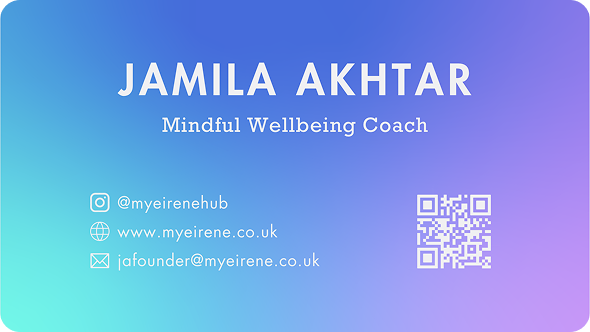
The company name, ‘MyEirene’, came from the Greek goddess and personification of peace, Eirene. Put together ‘My’ and ‘Eirene’ became an abstracted play on ‘my peace of mind’.
Working with this in mind, it became clear that we needed to represent the goddess Eirene herself as well as to create synergy between the words ‘peace’ and ‘mental health’


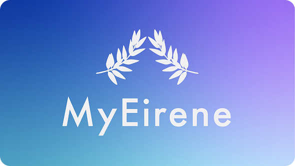
I developed a hand-drawn logo mark of an olive branch forming a crown which was paired with a crisp type font I had chosen for the lettering.
In the earlier conceptual phase I played around with using a hand-drawn bust of Eirene but it felt too “on the nose” so I pared it back to a simple olive branch, which ended up working perfectly because not only was an olive branch a symbol of Eirene (therefore it could represent her), it is also synonymous with peace (think: “extended an olive branch”.)
I made it so that the olive branches mirrored each other and twisted upwards to form a crown, the latter of which represents the head/mind. The made the logo perfectly represent the synergy between ‘peace’ and ‘mental health’ which is what we were going for with the brand identity.
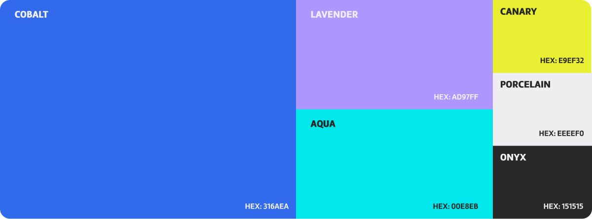
When it came to colour, we had to ensure that the palette felt calming and soothing but the company also wanted the colours to feel uplifting - to act as a sort of wayfarer which showed clients that by using their services, they would find ways to let go of the stressors causing their mental health to struggle.
Upon discussions, it was concluded that we had to avoid using the colours green or brown: they are often used in the health and wellness industry so it would not set MyEirene apart from any competitors.
From that point, we steered towards more blues and purples as our primary and secondary colours. The deep blue and lavender purple induced a calm, yet collected, professional aesthetic whilst the bright turquoise and the tertiary colour of canary yellow brought forth those uplifting energies.
Olive Branch Crown
Eirene, Greek Goddess of Peace
Sceptre of the Goddess
The use of icons/graphics was kept to a minimum, so I only developed three of them to keep things simple yet powerful and punchy. The olive branch was both an icon and part of the logo, whilst I drew the head of Eirene, modelled after the limited statues that were made of her. This also went for her sceptre, one of the goddess’ own pieces of iconography. Whilst she remained the figurehead of the brand, the sceptre stood for regaining your own control over your life and leading yourself in your own direction.
The icon style took inspiration from the style of ancient Greek artwork commonly found on pottery - black figure art - where figures were painted in colour (often black) and then lines carved out from the block of colour to create patterns, texture and outlines. Think lino/block printing. This style worked very well for the icons. Although only the olive branch crown icon got used predominantly, the end result of them all turned out well and the others were there just in case.
business card front
business card back
Because the company was an online platform and only a fledgling business, brand assets were simply not a priority and therefore all that was developed were business cards and flyers for marketing purposes.
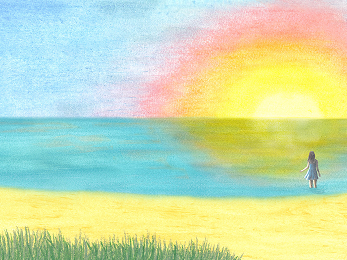
A branding and graphic project for a brand new creative blog that has recently been set up.
A branding and graphic project for a brand new creative blog that has recently been set up.