Those Darjeeling Days
A branding and graphic project for a brand new creative blog that has recently been set up.
London, United Kingdom
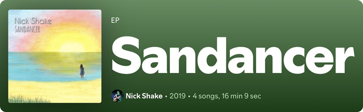
Design the album artwork for the debut EP of a London-based indie/folk musician.
The cover art needed to work across a variety of social media platforms as well as potential physical media, i.e. physical albums, so the artwork had to work across several different sets of dimensions.
It was also important for the art to represent the album’s overarching theme.
When it came to concept, inspiration came from the album’s songs themselves.
Each song had a specific theme, focusing on people that were part of the musician’s life who he had been heavily inspired by. This was seen in the naming of the album as well, which drove the direction I took when developing the artwork.
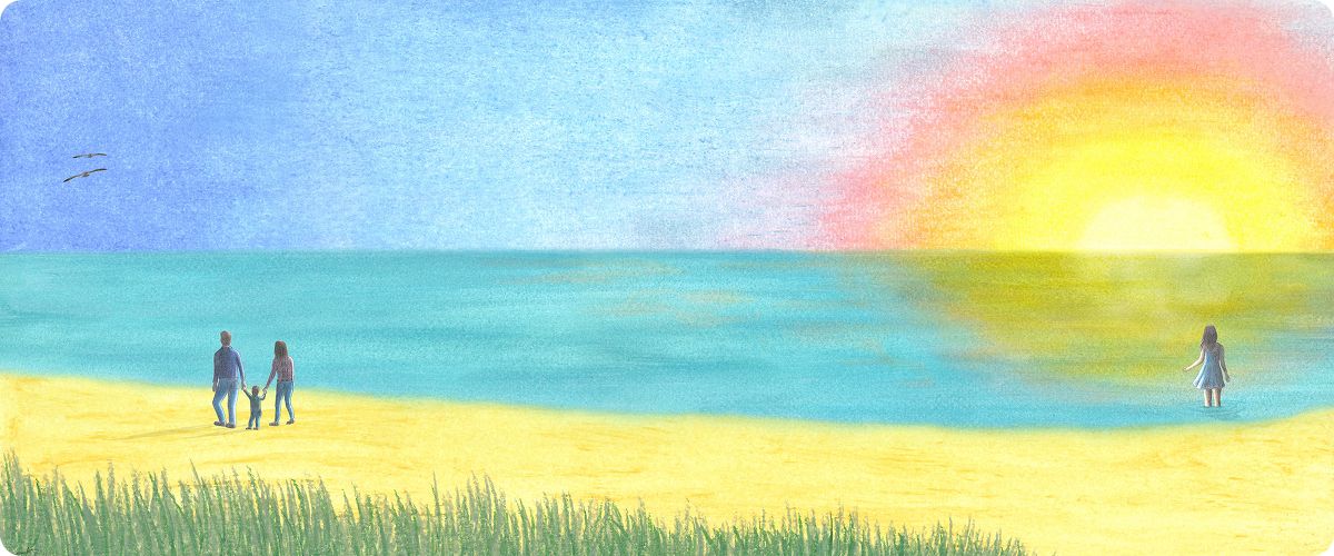
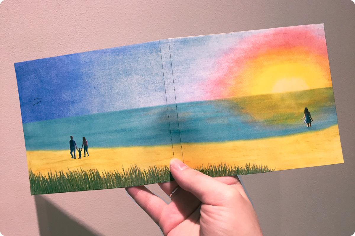
We wanted it to embody a sense of wistfulness, of sweet memories and sentimentality of a place once visited but since pivoted away from in search of more hopeful shores. It follows the ebb and flow of life’s cyclic nature.
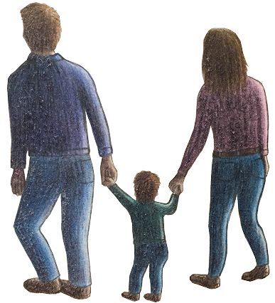
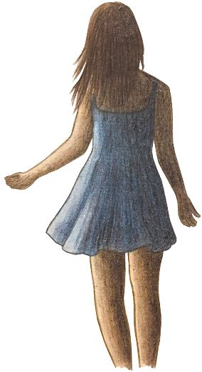
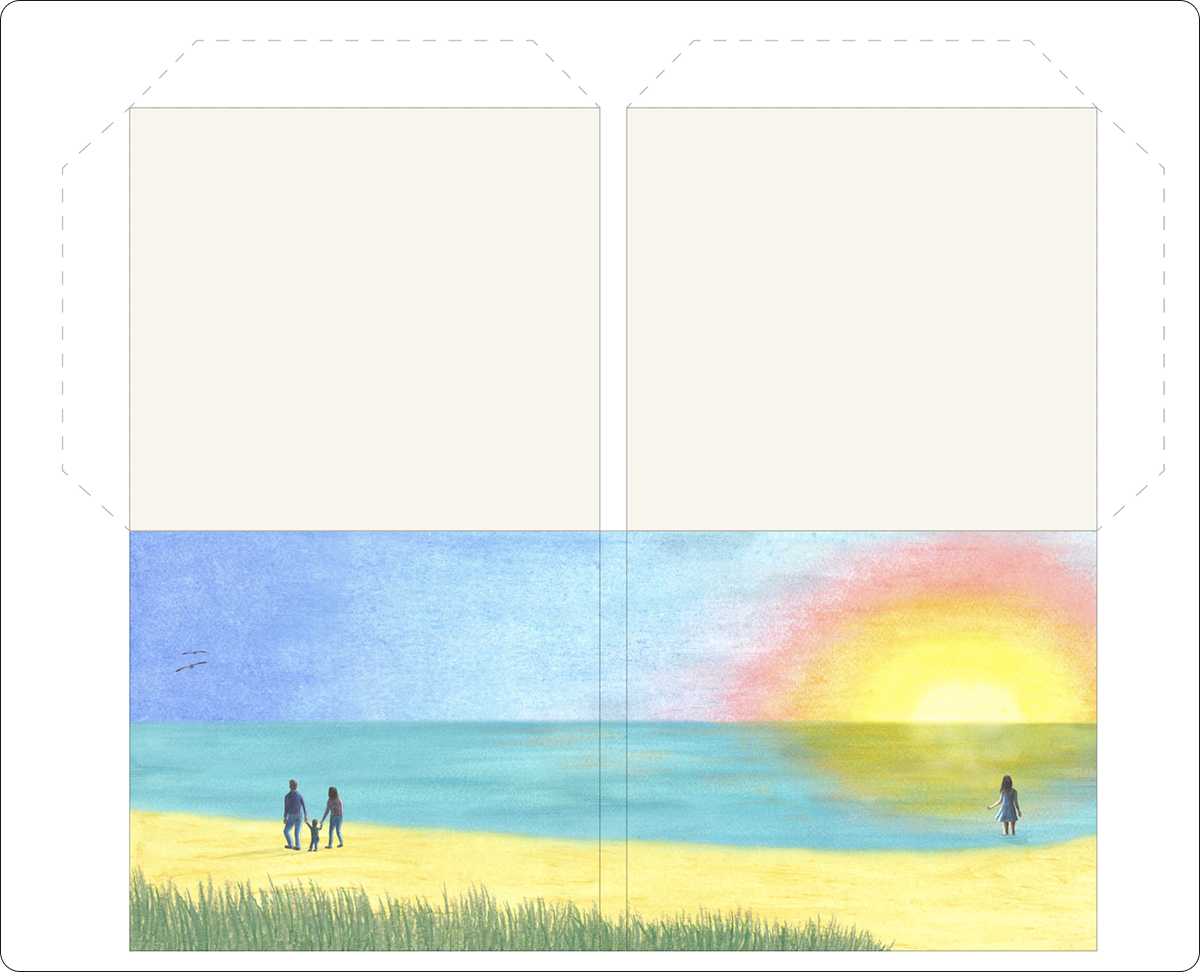
After several client discussions and a lot of input from the musician, it was decided to included characters in the artwork that were inspired by the people some of the songs were based on. The main song - named after the album - was taken from the colloquial term of the same name which is used to describe someone from South Shields a coastal town in the north of the UK. This is used to describe the person whom the song is about. Due to the personal nature of the album, it was clear that the artwork needed to be hand-drawn with minor digital edits to properly capture the intimate and sentimental nature of the songs and their subject matter. Having it be predominantly handmade lent it a realistic and personalized touch.
A sunset beach scene was chosen to capture the sentimental feeling, simultaneously serving as a nod to the ‘sand dancer’ origins. The final artwork was a multimedia piece made up of colour pencils, soft pastels, oil pastels and watercolours, all merged digitally. All characters were drawn by hand and coloured in with colour pencils. Each section of the beach scenery was composed using a different material to capture the texture of each element. The sky was made using soft pastels, the water was created with watercolours and to finish it off, the rougher sand and the beach grasses were done with oil pastels to produce a gritty textured feel.
Lorem ipsum dolor sit amet, consectetur adipiscing elit. Fusce quis mi et sapien luctus pharetra. Sed et diam in sem tempus viverra non vel enim. Class aptent taciti sociosqu ad litora torquent per conubia nostra, per inceptos himenaeos. Nam quis vulputate diam.
Suspendisse potenti. Aliquam rhoncus purus eget ipsum venenatis, eget venenatis nulla aliquam. Vivamus finibus, metus non pellentesque ornare, turpis urna eleifend mi, a suscipit sem massa et ligula. Suspendisse sit amet libero at urna blandit molestie at sit amet risus.
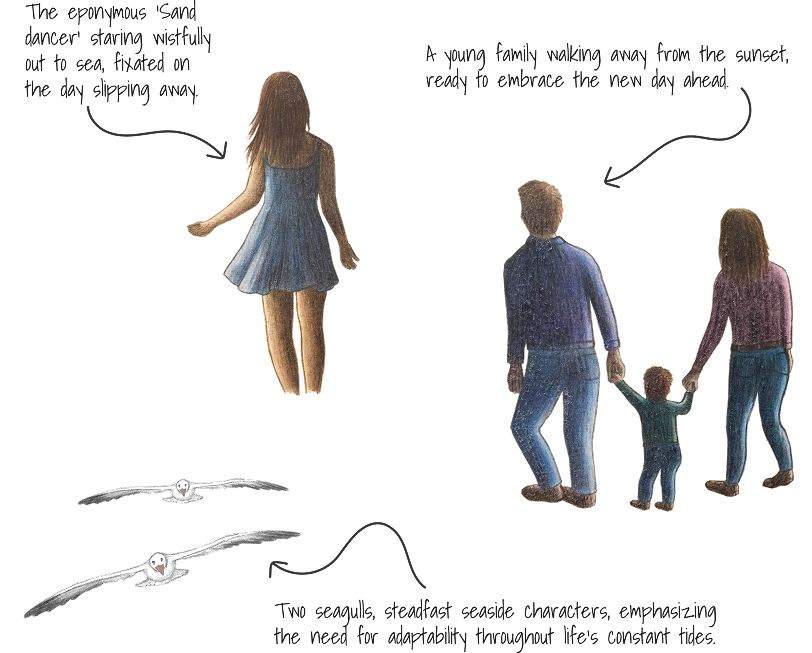
Characters were based off of two tracks on the album: ‘Sandancer’ and ‘Babysteps’, being the woman and the family resepctively. The seagulls were added to provide a more coastal feel and deeper symbology.
A branding and graphic project for a brand new creative blog that has recently been set up.
A branding and graphic project for a brand new creative blog that has recently been set up.